cBEYONData
cBEYONData is excited to be named a leader in BI, Big Data Consulting, and SI! We are constantly growing and are excited for our recognition by Clutch. Our company works mostly with the government; however, we also have experience working with the education and financial service sectors.
Clutch creates review-based evaluations for service providers with the hopes of providing a resource for possible clients. Their team collects reviews over phone interviews with past clients. Clutch’s analysts then compare data from multiple companies and create lists of high performing companies each with a “Leaders Matrix”. cBEYONData has been placed as number five on the Leaders Matrix for the top big data analytics companies.
Take a look at what people are saying about cBEYONData!
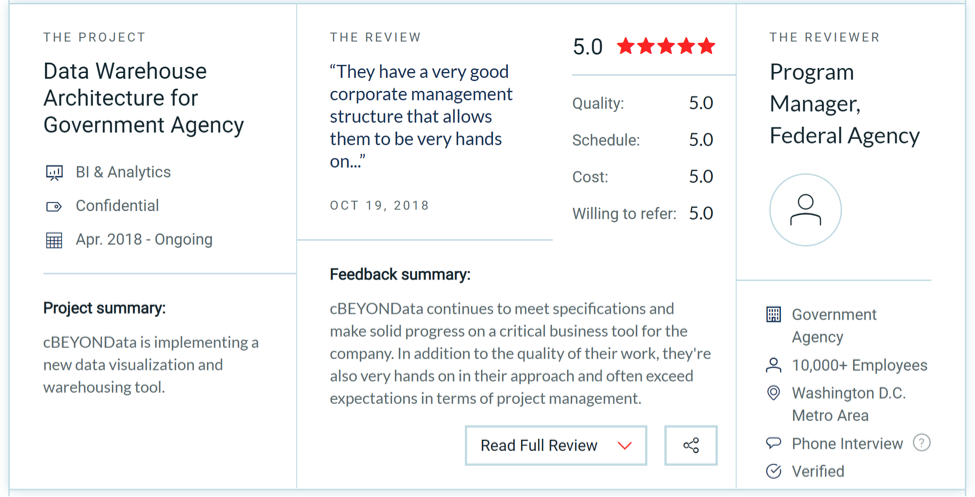
“They have a very good corporate management structure that allows them to be very hands-on…” – Program Manager, Federal Agency
“The upgrades cBEYONData is making to our system is going to significantly improve internal efficiencies.” -Financial Systems Officer, Legislative Branch Agency
“Their work has been very well received over the years…” – Director of Information Services, Medical Device Company.
Visual Objects highlights business rankings in the form of a company’s portfolio work. A client is really able to visualize their ideas by seeing the past projects of various companies in the same service sector.
“We are thrilled to have been chosen as one of the leading Big Data Consultants two years in a row!” – Theresa Backus Dunn, Director of Marketing at cBEYONData
If you are looking for a solution for your next project, let us know today!

cBEYONData is a professional services firm focusing on Business Analytics, Data, and Visual technologies and implementations. Our team of highly experienced consultants will successfully design, execute and guide you through the implementation of your solution. We know the key to a successful implementation is to tailor the solution to the customer’s specific needs. We are being awarded Top IT Services Firms Award in Virginia 2019 by Clutch.
Clutch is a B2B market research firm featuring ratings and reviews for over 9,000 IT service firms agencies worldwide. Clutch helps businesses make the decision about who to hire to solve their firm’s challenges by providing reliable information on top-performing firms centered around client-feedback.
We have many satisfied clients that have provided feedback, here is our latest review on Clutch:
We have been featured amongst B2B firms on The Manifest. As a sister site of Clutch, The Manifest is a B2B firm description platform that features top companies alongside business news and how-to guides for firms to help them improve and develop. It serves as a resource for small to mid-size companies in a blog type format and provides industry insight.
Check out Visual Objects, Clutch’s new sister site. It is a visual portfolio site that highlights top B2B companies. Take a look at company profiles that highlight the creativity of the work so that you can envision what your project might look like. We are featured here under their top custom software developers. We are grateful to Clutch for this recognition and we thank our clients who left us with feedback that not only helps us improve, but helps future customers me more knowledgeable. Contact us for more information!
Our team knows the key to successful implementation is to cater to our clients’ specific needs, which is why we specialize in a wide range of technologies. We are thrilled to share that Clutch.co recently ranked us in their 2019 report as the #1 in operations and process management as well as #4 among leading risk management companies!
Based in Washington D.C., Clutch is a B2B ratings and reviews platform committed to connecting businesses with the best agency or service provider to tackle their specific needs. They analyze thousands of firms based on reviews from their clients, their industry knowledge and expertise, and their ability to deliver high-quality services. Through their unique method, analysts have spoken directly with our clients and received extensive knowledge about our iterative approaches. Our 10 reviews allow potential clients to understand a project and a client’s experience at a quick glance.
In addition to being recognized on Clutch, our success expands to the firm’s sister-sites: The Manifest and Visual Objects. The Manifest publishes industry reports, tech news, and how-to guides to help businesses efficiently find their next partner. Here we are listed among other IT services firms. On the other hand, Visual Objects is a portfolio platform designed to help prospective clients visualize a future project before hiring a firm. For example, you can browse through the work of branding agencies.
Without our incredible clients, we would not have been recognized by Clutch for our expertise in risk management and big data operations! We’d like to thank them, as well as Clutch, for taking the time to review our professional services. Our team is looking forward to implementing more successful solutions for our clients.


cBEYONData is a results-driven firm that provides value to government agencies and organizations through Business Intelligence (BI) solutions for the CFO’s Office and end-user missions. We ensure our customers’ analytical and reporting requirements are met through solutions such as financial reporting, audit readiness, DATA Act analytics & submission, procurement & external reporting, dashboards, analytics, visualizations, and geo-mapping. cBEYONData is committed to customer success, as demonstrated by our strong customer retention rates, references and awards.
Published on March 18, 2019 via LinkedIn, by Jeremy Kuhlenbeck
Next up in my 14-in-2 dashboard development series is the 5 insights for speed and clarity. So let’s jump right in.
(Btw, as I started writing this out, I realized that five in one post would make for a very long read. Stick with me over the next few days and weeks to walk through them one at a time.)
“The most difficult thing I have ever had to do was tell my boss that a project needed to be shelved.”
1. Purpose
I know, you think this is a copout here.
Purpose cannot possibly be an insight – can it? A defined purpose is an absolute must, and this is where you are going to have to talk through the tension and build trust with your boss (more on that in a bit).
What I mean is, many projects start out with an extremely vague purpose:
“I need you to build a dashboard for our warehouse data…. I need you to build a dashboard around our food industry data… I need you to build a dashboard on our executive finances.”
These are NOT purpose statements. What these are, actually, are inroads for your company, your boss, or whoever is paying you to keep you and your company employed.
Therein lies the tension. Our companies need to always be drumming up new business, so they will find every sliver of an opportunity to get you in the door. Once you are in the door, however, it’s up to you to know how exactly to establish the purpose for your work (See BIDS Methodology on BIBrainz.com)… and, it’s up to you and your boss to know how to pull the plug on a project that cannot find its purpose.
The most difficult thing I have ever had to do was tell my boss that a project needed to be shelved. For whatever reason, be it the data was not ready, the business rules, calculations, or formulas were not yet established by the business… it’s important to know when a project is not ready and note what is the responsibility of the business SMEs and what is the responsibility of the developer.
Build your relationship with your boss. Build trust so that when you tell him or her that the project lacks direction or purpose, together, you can come up with a way to politely shelf that project and pivot to another. Then, your team will have to find a way to help the leaders on the shelved project get ready for another run at it in the future.
So how do you find a project’s purpose?
Well, in the coming days and weeks I’ll discuss the remaining insights. These insights tie in so tightly to purpose that we will see it develop as we go through them all. For now, let’s look at some situational examples of purpose at a high level.
Real World Example #1
Food Industry Store: Company XYZ
Company XYZ is excited to bring you and your team in and establish some dashboards to help them drive insight and make better decisions regarding their food industry sales and usage. After a couple of meetings, you were able to determine that they have two main issues and one missing metric.
- First, data is siloed into two areas, the transactions of the stores and the cost of labor for those employed at the stores.
- Second, the current decision-making process for products is based on the metric / key performance indicator (KPI) of sell-through percentage or essentially the turnover of products put on the shelves each day.
- And last, they are not yet analyzing the profitability or margin of their products. Sell through percentage is their current gold standard.
From these discussions, we can determine that our goal is to correlate a “true-er” cost of goods sold by bringing together the vendor price for each product and the labor cost of the employees for the stores. Together, with the sales cost and sell-through percentage, we can help identify profitable and in-demand products.
Boom. Purpose.
An interesting byproduct here is that after seeing the data in a dashboard for a while, the company can begin to develop core values for new products they introduce to the stores. If a product doesn’t meet a minimum margin threshold, don’t bring it in… turnover is slow, I don’t care how amazing the product is, don’t keep it around.
HUGE TIP HERE:
This is where people like you and me can get tripped up. Just because you are a brilliant thought leader, that doesn’t mean you are supposed to come into each situation bringing your own formulas or calculations (but double check everything they give you). I know this sounds weird, but I have seen it over and over, the developer gathered requirements to do a certain calculation, didn’t ask the business SME for the formula, went back to their desk and decided to figure it out on their own. Why? Ego, assumption, or lack of communication – because it was not comfortable to push the issue or simply due to the developer assuming they already know how to get there.
The business has most likely been doing some reporting for a while now. They have their formula or know how they would like it calculated once you bring the data together. Their SME is with you precisely for this moment (let’s hope that they have benchmarked with the industry standards – you can lead them into that if you feel they haven’t).
Using the BIDF spreadsheet from BIBrainz.com will help greatly in this metric requirement gathering process, but your job here is very specific. You identify the metric, in this case, Cost of Goods Sold (COGS) with Labor. Write that down, and then ask them how they calculate the labor costs into the cost of goods sold. If they do not have the calculation on hand, let them know you will need them to get that for you in order to include this metric. They own whether or not this metric is added to the dashboard by doing their homework and bringing back the company’s preferred formula.
Again, I’ve seen so much wasted time in this specific area of a project. Some developers are less of the “communications type” and more of the “data type”. They feel that it is more comfortable to try and figure it out on their own than it is to let there be an awkward silence in a meeting with the SMEs or they just don’t feel comfortable giving the SMEs homework. I DON’T CARE. YOU WILL WASTE TIME or possibly fail if you don’t push out of your comfort zone, communicate clearly, and let the business know what you need from them.
Continue on with this same KPI and formula requirement gathering process until you are done gathering all the KPIs. Try to keep your KPIs down to three to five. Engage the SMEs in open discussion on their thoughts on the importance of each metric to get them to hear their coworkers’ opinions. Let them come to the conclusion on which three to five are the most important. Also, don’t fret if you only have one or two. You can definitely build a dashboard with great insight around just one or two metrics.
In my real-world example here, I was able to bring the siloed data together for the first time for Company XYZ. What was fascinating was seeing the stores that had hit their preferred goal for sell-through percentage and and then layering on the profitability and labor costs metrics. When we added the product profitability and cost of labor for the first time, the company realized that sell through percentage on its own was extremely misleading.
Some of the stores that hit the sell-through goals had either labor costs or products costs that were well above their industry standards. The decision and dashboard from that point forward were to always have these three metrics displayed together – COGS with Labor (e.g. Estimated Revenue), Sell Through Percentage, and Food Cost Percentage. These three provided the clean and clear insight they needed.

Real World Example #2
Accounts Payable: Company XYZ
Company XYZ loved what you did when you built their dashboard for Estimated Revenue, Sell Through Percentage, Food Cost Percentage, so they brought you back to help with the Finance side of things.
In the finance group, it was determined that most vendor contracts require interest to be paid on invoices over 30 days old. The company would prefer to not pay more than they have to, so obviously avoiding interest charges was important. Now we are finding our purpose.
We were able to determine that the goal of the dashboard would be to guide the accounts payable personnel to interest-bearing invoices that needed to be paid off. Since there were already a few, we set a goal for this metric to pay off 15 percent of all interest accruing invoices by the first of the next month – every month.
Additionally, assist these same individuals by identifying the count and cost of invoices that are coming due over the next 10 days. This information would provide the margin they need to get ahead on payments before incurring any interest.
To round things out, we added a third metric for more margin and provided the count and cost of all invoices coming due in the next 30 days. Somewhat duplicative, but a good, aggressive mindset.
In this real-world example, I ended up developing the solution in Tableau. The bottom third of my dashboard consisted of three columns, a list of Past Due (Over 30 Days) invoices by invoice number, an “actionable goal” dynamic calculation for Past Due invoices, and a list of the invoices that are coming due in the next 10 days.

The dashboard user was able to select or shift-select multiple invoice numbers in the past due column which would then update the actionable goal column. If the goal is to pay off 15 percent of all interest-bearing invoices, the user would see instantly what percentage of the goal the invoices they selected would cover. If two invoices were selected and they were at eight percent, they could shift select more until they saw that they hit the goal. They were then able to write down those invoice numbers, take the necessary payment action, and know they accomplished what Company XYZ had tasked them to do for the month.
They were also able to look at that third column and identify if they had enough financial margin to start paying invoices in advance of accruing interest.
Final Thoughts on Purpose
For speed and clarity, make sure you have a project document that starts with a purpose statement – work on this together with the SMEs so they can see the progress or lack thereof. Conduct a couple of initial meetings, and if you are not able to come to a clear and concise purpose statement, you will have to re-evaluate and decide if you are on track to developing the purpose statement or have that difficult discussion with your boss about shelving the project.
“A clearly defined purpose statement is your first priority. It will either build your project momentum or get you out of a project within the first week.”
Purpose = clarity. Lack of purpose will always lead to scope creep. A clearly defined purpose statement is your first priority. It will either build your project momentum or get you out of a project within the first week.
How to use your purpose statement:
In your subsequent meetings, use the purpose statement that you jointly developed with the SMEs as your boundary or safeguard against scope creep. Because the purpose statement was a joint effort, your SMEs now have buy-in on the goal and will be better receptive to “parking” those additional thoughts and ideas they come up with for potential future projects.
Quotes on Purpose:
“Without a purpose, your story will fail to connect with the audience.” –The Anatomy of a Data Story by Nicole Hitner
“Execute. Execution is the only thing that matters but how do you execute? It starts with having clear goals. You need to know exactly what it is that you’re trying to accomplish. If you don’t know what you are trying to accomplish you are never going to get there. That is simply the clear truth.” -Tom Bilyue as a co-founder of Quest Nutrition, the second-fastest-growing private company in North America on the Inc 5000 for 2014 (ok, its says goals but translate that as purpose)
“I built 14 dashboards in two months and it is my best work.”
Let’s get something straight right from the start. I did not intend to build 14 dashboards in two months. In fact, I wasn’t even hired to build 14 dashboards in two months. The truth is, I had six months… but the wrong tools.
In late October, I was airdropped into a team that consisted of two – another BI developer, who is my data SME and someone I had already worked with, and me.
That’s it.
I knew I was being brought in to help with some dashboards, but 14? In two months? I might have second guessed joining if I had this information up front.
What happened to the other four months?
I won’t get too far into the weeds here, but we can chalk up the first four months to the onboarding process and the wrong tools. I was allowed into the workplace but had to undergo a background check before I was allowed access to the network, company computers, data, or software tools.
Like all companies, the intent was to use the software solutions they currently owned. I am open to anything and trust my methods, so I engaged the challenge. What we discovered, in a very painful way, is to stick with the upper right quadrant of the Gartner chart for data visualization tools. As the saying goes, “you get what you pay for, ” and if your visualization tool is free… well… you get what you pay for.
During those four months, however, we made the case for the right tools, developed a comprehensive guide to which tools those were (i.e. Tableau and Power BI), and set out to prototype the dashboards.
In the end, because I still had to use my own equipment, we prototyped in Tableau on my personal computer using scrubbed data extracts, achieved sign-off on the dashboards using the BIDS methodology, and then converted the Tableau prototypes to their existing SAP BusinessObjects environment.
Yes, with enough creativity and the right methodology, you can make a BusinessObjects report work effectively as a dashboard.
What is the right methodology?
Picture this, you are stepping into a conference room with a group of SMEs to discuss your next dashboard project.
Do you see it? Now let’s adjust that picture a bit.
You are walked to a cubicle barely big enough for one, introduced to a person who didn’t know you were coming, grab the rolling filing cabinet from under the desk so you can sit and begin your process.
Are you ready for it?
If you even question the ability to say yes in either of those moments, then it is time to invest in yourself. I urge you to seriously consider training with Mico Yuk and folks at BIBrainz.com. Purchase the online course BI Data Storytelling Mastery (BIDS).
I have been building dashboards for quite a few years, but during my four-month waiting period on this project, I took the time to attend Mico’s latest webinar on Master Data Storytelling. I wanted to see if anything had changed since the days of the BI Dashboard Formula Methodology (BIDF) class which I had taken a few years earlier.
I quickly realized that the BIDF and the BIDS classes were not one and the same. I knew what I was watching in that webinar had the ability to change my process greatly, but I wasn’t quite ready to invest. I have been fairly successful these last few years and I was on the fence. At the end of the webinar, Mico emailed out a freebie – The BIDS Analytics Design Guide Template.
I immediately did two things after opening up that freebie. One, I forwarded it to everyone that I had previously worked with, and two, I got out my credit card and I purchased the class as an investment in myself.
–Full disclosure: The company I work for, cBEYONData, liked what I had to say about the class and did reimburse me for the expense. You have to love a company that knows how to invest in their people.–
The design guide template is a one-stop-shop for building trust in your work. The design guide’s purpose is “to help our clients scale their analytics visibility and branding by setting a standard for others to use.”
In the guide, you will find a standard for:
- Applying colors
– A trusted color palette (remember this is a standard)
– Best practices for color usage
- Applying fonts, font sizes, and when you should adjust them in your design
– Headers & Titles
– Sidebars & Sub-labels
– Tile Headers
– Detail Text
- How and where to apply icons
- How to design charts and tables
Additionally, you get a glimpse into the standards for dashboard layouts which includes examples of how all the above are applied to a typical dashboard. The layout provides a purpose for every piece of real estate on the dashboard.
Let me repeat, this was the FREEBIE!
A Repeatable Process
Success requires multiple skills, all of which can be learned. To be great, chose to learn them and chase after the following skills:
1. The Tools: Learn how to use the right tools. Stick to Gartner’s upper right quadrant and start with Tableau or Power BI.
You could find no greater mentor for these tools than Kirill Eremenko. I stumbled upon Kirill a few years back by purchasing one of his Tableau class on Udemy.com. He is by far one of the best teachers I have ever discovered and I am committed to seeking him out first when I need to learn something new in our field. He is extremely passionate about Data Visualization and Data Science. You can find more classes from Kirill on his membership site at SuperDataScience.com.
2. The Overall Process: Learn the BI Data Storytelling (BIDS) Methodology from Mico Yuk at BIBrainz.com.
This will change everything from the first question you ask to how you maintain scope throughout the process all while ensuring you will get successful sign-off. Users will buy in because you will build trust. You will maintain focus because the multitude of cheat sheets and guides that walk you through each step of the process will ensure you stay on track.
3. The Requirements and Documentation: Learn the BI Dashboard Formula (BIDF) Methodology for requirements.
There is a primer for this in the BIDS class as well, but the BIDF tools are your key to requirement gathering, documentation, and ensuring the SMEs or business users own their role in making sure you can develop what they are asking.
4. Note Taking: Take great notes. Don’t take good notes, take great notes. Learn to Bullet Journal.
Can someone else open up your notebook and immediately take over? In less than 30 minutes, you can learn how to Bullet Journal. There is literally no expense required other than purchasing a notebook. My favorite is the Cambridge Notebook that I picked up at my local Target for $7.99.
I watched the videos on the Bullet Journal website and a few on Youtube.com, but my key was writing the details of the system in the final 10 pages of my notebook as an appendix to keep with me at all times as a reference guide.

5. Organization: Learn the Getting Things Done method (GTD) to stay organized.
Have a trusted system of organization for all your documents and e-mail. Every day your inbox will be emptied, e-mails you sent for follow up will be in a trusted location, e-mails that require action will be in one spot, and all your project related emails will be in project folders.
You can find wiki pages and lifehacker-type sites full of instructions on GTD if you want to save a few dollars. Use this system to free your mind up from all the little things that are crowding your brain.
6. Attitude: Last, but most importantly, learn how to adjust your attitude. Manipulation is not a bad word when you are using it on yourself, to adjust yourself, to set yourself up for success.
So much of what I have accomplished started out simply because I chose to walk in the room with the right attitude… I sat down in someone’s cramped cubicle with the right attitude. Let your attitude echo your confidence.
On your way to work in the morning, put something in your ears that will set the tone for your day.
My current favorite is MORNING MOTIVATION – How Successful People Start Their Day.
My all-time favorite is the first 4:10 of following When You Are About To Give Up
(Use the Youtube Music app to listen to the audio only.)
Check out more from the following folks on Youtube:
a. Be Inspired
I have been thinking a lot about Technology Business Management (TBM) lately.
The approach the federal government is taking to roll out TBM is reasoned and reasonable. I came to this realization while moderating a panel discussion with federal government leaders from OPM, GSA, DOE, PTO and VA. Instead of mandating the implementation of TBM, OMB is suggesting that agencies look at how to implement TBM, working with them to identify best practices and building a “playbook” for the rollout. Since it is not a mandate, the most forward-thinking agencies are taking the lead, and helping GSA and OMB as part of the learning process.
To me, this is a very reasoned approach, which recognizes that the unique aspects of rolling out a program across the federal government. It is sometimes very frustrating for those of us in private industry to witness how hard it is for the federal government to implement an improvement, especially one as significant and as complex as Technology Business Management. I think it will eventually become a mandate, and I think most of those in the federal government watching this are expecting it to be mandated. When it finally becomes a mandate, the “playbook” will be mature and full of lessons learned and best practices. It will be something that agencies can use to accelerate the success of TBM across their organization.
The transparency of IT spending will improve greatly when TBM is implemented across the federal government. Standardization of IT data will encourage organizations to benchmark their spending compared to other federal organizations and even commercial ones. At cBEYONData, we see this as a huge opportunity for us to help the federal government by automating and standardizing the way financial IT data is captured and reported. It is similar in many respects to the way federal organizations have standardized financial data in order to comply with the DATA Act. For the DATA Act, we integrated automated data checks and processes that has helped our clients stay on top of data quality, so that what is reported is accurate and timely.
The hardest aspect of implementing TBM, in my opinion, will be allocating cost and hours accurately. We built a TBM solution in our CFO Control Tower by bucketing cost into the IT Towers using already available reference data such as the Transaction Code and PSC. This gave us nice analytics and dashboards, but the bucketing process was manual and done with assumptions that may not be appropriate. In order for the results to be highly accurate, the “bucketing” needs to be done as early in the process as possible, ideally at the time the cost or hours are recorded. For example, when a government employee enters her time, she should select the proper code that will map to the appropriate Technology Business Management taxonomy. Of course, we all know how hard it is to get everyone to enter their time using the right project codes, so this becomes a management challenge as well. Imagine if she worked on several Towers over the course of a day? How is that accurately captured?
There are definitely solutions to do this accurately. Commercial businesses are doing it now, and the work OMB and GSA are doing to develop the “playbook” for implementing TBM will provide guidance that will help ensure accurate data. And, of course, companies like cBEYONData will be helping the federal government along the way, providing our expertise to reduce the administrative burden TBM will add. I am definitely excited about our role in this process, and think the automation capabilities contained in the CFO Control Tower are a perfect match for TBM. And as a taxpayer, I am especially excited to see the results Technology Business Management will provide. Let’s get it done!
Michael Huffman is the Vice President of Sales at cBEYONData and will be leading the company’s TBM efforts. He has been with the company since July 2017. During his 28-year career, Mr. Huffman has spent over 18 years building, growing and managing organizations, programs and projects. He has extensive experience with consulting services delivery, including successfully winning and managing Firm Fixed Price and Time and Materials contracts.